Water Colour Presentation at Process

I’m looking forward to doing some live watercolours tomorrow and talking through the process at, appropriately enough, Process at Gosh Comics  tomorrow evening…

Process
Gosh Comics
1 Berwick Street, London W1F 0DR
Wednesday 6th November 2013, 7pm

8-WatercoloursCome along to this fantastic free event.  As well as my presentation you can listen to Andy Poyiadgi talking through putting together his exhibition for The Lakes comics festival and Lorenzo Fiorini will be talking about an instructional essay on storytelling visually that he was given by Eduardo Risso (100 Bullets, Batman: Noir).

9-Watercolours-1st-Layer11-Watercolours-3Watercolour Life Painting 15.11.11Watercolour and Ink Life Painting 7.2.12LucyWatercolour09LucyWatercolour13

The evolution of Muesli and Servers

Here’s a recent Business Illustrator infographic I did for Swiss IT company, Cassarius. It contrasts the development of the computer server to that of famous Swiss breakfast, muesli, …

Evolution-of-Muesli-and-Servers-English-for-print-Tower-FormatWhile the working language was English, my clients provided a German translation for the finished work.

Evolution-of-Muesli-and-Servers-German-Panel

The best part of this was learning that the German word for “health enthusiasts” is “Gesundheitsfreaks“.

Creative Scribing at Camberwell / 8 Tips for being a Creative Scribe

Last week I had the pleasure of being a Creative Scribe (aka illustrative scribe) at a meeting at Camberwell College of Arts.

Representatives from each of the colleges that form the University of Arts London gathered, all of them working with the colleges’ curation, galleries, conservation, archives, museums or special collections.  The aim was to discuss ways for the amazing archives to interact and develop.

By chance, the meeting took place in a Lecture Theatre at the college where years ago I had a desk, doing my degree in Ceramics and had fun making three dimensional comics out of clay.  Sad to see the Ceramics degree isn’t running there anymore, but nice to revisit the place.

Anyway, for those not familiar with creative scribing, it’s an enjoyable but sometimes terrifying challenge for an illustrator.  The artist sits in on a meeting, event or series of talks.  Armed with paper and pens (or some other mark making device) they visualise what is being discussed.

Often the work is then used as a discussion point at the end of the event.  Sometimes it is taped to walls for viewing.

Here are some tips, on being a creative scribe for anyone into that kind of thing…

1.  PREPARATION
As creative scribing is essentially live drawing and note taking in reaction to what is being said in the present, there’s little you can do in advance.  No prep – woohoo!
Of course, making sure you know what the themes of the event/talk will be, should certainly give you a head start.  A small amount of research if the themes are alien to you may be a good idea too, but you’re not being hired to be an expert in the field.
Make sure you’re well rested and feeling fresh before you head into the arena!

CamberwellCreativeScribing1

2. TOOLS OF THE TRADE
Sharpie Coloured Markers.  You want to do your scrawling with something that is quick and clean to use.  A range of different coloured markers works for me.
Uni Posca thick painty Markers.  These are great for filling in paper with nice opaque blocks of colour.
Pencil Case (preferably with a Buffy or Wacky Races design).  Keep yourself organised!
A2 Paper (thick enough to use markers on).  It’s easier to stay on the same page and work outwards than to keep having to change sheets of paper.  You’ll want to work big so that people clearly once the work is viewed/displayed.
Masking Tape.  Sometimes the best place to work at an event is on a wall with the paper taped up.
Pencil and eraser.  It’s extremely unlikely you’ll get the chance to pencil anything out before using the markers, but just in case.
Note paper. For scrawling quick notes of things you’ll want to draw later.
Tippex.  Not something to rely on but you never know.
Mobile Phone/iPad/Dictionary. There may be moments while scribing where you desperately need to look up an image as a quick reference.  How many eyes does a duck have?  That sort of thing.
If you’re like me, there may also be spellings you need to check too.  Worth remembering that you may not be able to get phone reception/wifi where you are.  If your dictionary app relies on that, then a mini paper dictionary (remember them?) is just as good and fills you with waves of nostalgia too.
Water, healthy snacks/lunch – to keep the brain going.  Maybe a Red Bull for emergency fuel towards the end of your session!  Though officially I don’t endorse that as it’s not good for you.  Delicious and refreshing though.

CamberwellCreativeScribing2

3. GET YOURSELF SORTED
Once you kick off, every second counts, so you need to be wasting as little time as possible.
Find yourself the best possible place to listen and draw first.  If no table or desk is handy, taping paper to a wall or window is a decent easel.
Make sure you know where each colour of pen is.  I divide mine into different compartments in my pencil case (hot colours on one side, colds on the other) or rest them in organised piles where you can grab them with no fuss.
If you’re working in paper from an A2 sketch book, tear out a few pages in advance so you can quickly move from one sheet to another.
This may all sound a bit OTT but you could find yourself drawing faster than you’ve ever needed to before so whatever helps!

CamberwellCreativeScribing3

4. WARM UP
Do a few easy drawings before you begin for real.  The first drawing you do will probably not be your best, so good if this isn’t part of the work you’re going to display.

5. NO NEED TO PANIC
Even after doing warm up drawings the first drawing you do for realsies could still be something you want to burn, or launch into space or feed to a goat.
There’s no need to be a perfectionist – you don’t to get every detail that the speaker is talking about down on paper. Just key points, and things you find interesting to visualise.  This is creative scribing not dictation, damn it!
No one assumes that the way you creative scribe is as good as you would draw given a proper amount of time.
Worse case scenario – if something a speaker says sounds like it’s pretty vital but you don’t hear it properly or understand it, you can always leave a bit of a space and go and ask them about it in a coffee break, then fill it in later.  Most likely the speaker will not rush through the really important points though, so as long as you’re paying attention you should be fine!

CamberwellCreativeScribing46. DON’T GET TECHNICAL
The speaker may be describing something which is way beyond your understanding.  We can’t be artistic wonders and experts on everything else too!
The good news is you’re there to visualise ideas, not do blueprint drawings of stuff.
If someone if discussing the way a new piece of software improves performance on a super-computer.  An image of a happy computer user can tell the story as well as a badly informed image of microchips, enhancing the circuit board thingy via a disk utilisation wotsit.
You get my point.

CamberwellCreativeScribing5 7. STAY ESSENTIAL
Don’t feel you have to add detail to your drawings straight away.  Get the essentials down first, then add extra colour/details later.  This may mean when the speaker is saying less vital stuff, going over old ground, there’s a coffee break or the projector breaks down (always a godsend for a creative scriber).

8. STICK TO 3-4 COLOURS PER IMAGE
It saves so much time.  I tend to switch colour scheme between image/talk/speaker.  This helps to differentiate between them, and looks good when the pages are displayed altogether.

CamberwellCreativeScribing6Well there you go.  Hope that’s helpful to some of you.
Now watch as Creative Scribing sweeps the nation

Lucy in watercolour – A step by step process

So for #63 of my  webcomic Lucy the Octopus I wanted a moment for Lucy, and the reader, to pause and reflect after a trying time.  This is the end of a story that takes place over a couple of days in Lucy’s world, but took over four months in real time with one strip coming out every week.

Doing one large pretty panel in watercolour seemed like a nice way to do it…

I’m used to doing Lucy seascapes now, so pencilled it out without too much fuss.  I did try to keep the pencil lines cleaner and tighter than normal as I didn’t want too many pencil marks visible under the watercolours.  It’s not possible to erase pencils efficiently once they’ve got a layer of paint over them.

For those not used to watercolours, the basic idea is to build up layers of paint, starting with the lightest colour in any given area…

LucyWatercolour01
I use a Pro Arte Acrylix brush (size 3).  It’s actually designed for acrylic paints, so it’s durable and keeps its shape.  As a vegetarian I try to avoid buying stuff made of animal bits, so I also chose these brushes because they’re synthetic rather than horsehair.  I use these when inking too.

After doing the edges of any given patch of colour I may switch to a larger brush to [WARNING – TECHINICAL TERM COMING UP]… fill in the big bits.

It’s nice to have a range of colours from light to dark so I make sure I leave some paper showing through where the light catches the large yellow rock  formation.

LucyWatercolour02
When adding a layer of watercolour over an existing layer, the wetter the bottom layer is, the more the top layer will run into the bottom.  This makes for a softer transition between the two.  I’ve done a bit of this in the large blue sea area at the top of the page.

Where I want a sharper edge to the area of colour, I make sure the layer below is dry.  You can see my hairdryer is always on hand for this!  This would be the case for the darker tone on the majenta coloured plants.

LucyWatercolour03
A close up of Lucy and Puffy.
Mainly at this point I’m mapping out basic colours, and will add further tones later.
I make sure the paint is dry before adding colour to a connecting area of the paper.  That way I can avoid, for example, the blue on Lucy’s arm running into the yellow of Puffy’s fin, resulting in a weird green that I would then have to disguise as seaweed.

Lucy looks odd without the black in her eye, but I must be patient!

LucyWatercolour04
Notice my watercolour set that dates back to at least the seventies.  I’ve had it myself since I was a kid, but I think my mum may have used it before me. It’s made by a company called Page.  It includes some small tubes of what was once wet water based paint but has long since dried up.  I still keep them in there because I like the look of them!

Anyway, all areas of the picture have at least one layer of paint on them now, so I can get a sense of the colours balancing.

LucyWatercolour05
A second layer of watercolour can be the same colour as the first, making the area richer and darker.

You can also use a different colour for subsequent layers, such as where I’ve used a light orangey brown on top of the yellow in the large rock formation.

LucyWatercolour06
Adding more tone and [WARNING – ANOTHER TECHINICAL TERM COMING UP]… splotches, to plants.

LucyWatercolour07
Here we can see my highly professional desk set up…

  • Paper napkins in case of spills or mistakes
  • Lucky Charms mug full of water for brush rinsing
  • Copy of Lucy the Octoups: Better in Small Doses for reference
  • Scrap paper to scribble notes and check the look of watercolours (they look very different to their dry in the box form)
  • The painting paper is a page from a Winsor & Newton Cotman Water Colour PadI rest it on the pad so I can angle the painting slightly as I paint, not enough for the paint to run, but enough that I don’t get back ache hunched over it.

LucyWatercolour08

This is all the watercolouring done.  Few speckles for sponge plants and rock texture.  A few more for general bits and pieces floating around in the ocean.

Also check out my shoeless feet.  Always paint without shoes on.
It is more bohemian so your art will be artier.

LucyWatercolour09On a separate piece of paper, I mark out where the lettering will sit – I have already laid this out on my Mac.  I then draw the speech bubbles with a drawing pen.
I will scan both pages and layer them using Photoshop.
I may want to turn the original painting into a print or postcard at some point, without any text.

I don’t know why I taped the painting to my drawing board to ink it.  I took the tape straight off again as I find it easier to ink, being able to turn the paper freely.

LucyWatercolour10

At last I can add the dark of Lucy’s eyes and she looks like herself!
I inked over the watercolours with Staedtler Pigment Liner drawing pens.  Mainly 0.5, a bit of o.3 and 0.8 too.

LucyWatercolour11It’s fun doing the black lines.  They define each area of colour, bringing the picture to life.

LucyWatercolour12
I add a bit of coloured pencil for the outline of the bubbles and Lucy’s patches, and some texture on the big rock formation.
I leave the rear rock formation without an outline.  This leaves it looking less defined and further away.

LucyWatercolour13
So there you go!

If you want to see the final lettered comic it’s #63 though if you don’t want to read this final page of the story before the beginning, the start of the story is here!

Cheers!

10 courgettes, a squash, 2 gourds and lots of pumpkins

The fantastic Lisa Woynarski is taking part in the intriguing Trans-Plantable Living Room as part of the Green Stage Project.

Trans-Plantable Living Room is a living, edible performance space, grown by community gardeners, which will host interactive performances during  September 2013 in Cardiff and London.

I drew this this illustration for the performance book.

Richy's-Lisa-Pumpkin-Pic

Portrait & Life Part 8: Ink

Here’s the final selection of images from the Portrait and Life class I was doing a little while ago.

Working in black ink, with no pencil roughs first was my favourite way to tackle life drawing.  You can’t be precious and have to make every line count.

Ink, Life 20 mins 24.1.12

Ink, Life 20 mins 24.1.12

Ink-Life-15.11.11

Ink, Life 15.11.11

Ink-Life-29.11.11

Ink, Life 29.11.11

Ink-Line-1.11.11

Ink, Life 45 mins 1.11.11

I’d love to do a comic in this style sometime, though maybe with people wearing clothes!

Portrait & Life Part 7: Charcoal

I hadn’t touched charcoal for years when I gave it a try in my portrait & life class.  I thought I wouldn’t be into the messiness of it, but after a while I started to enjoy how quickly you could fill a sheet of paper with light and tone.

The foreshortening on this first pic was tricky but it worked out okay.  if you start by drawing something mid-distance (in this case, the model’s left thigh) getting the other elements in proportion seems easier.

Charcoal, Life 70 mins 31.1.12

Charcoal, Life 70 mins 31.1.12

Charcoal, Life 10 mins 4.10.11

Charcoal, Life 10 mins 4.10.11

Charcoal, Life 15-mins, 4.10.11

Charcoal, Life 15-mins, 4.10.11

One more batch of life drawings coming soon!

Portrait & Life Part 6: Quickies!

Just remembered some efforts from a Portrait and life class I’d been meaning to post.

Doing super speedy drawings in a life class is scary at first but you can get some energy filled results.  Sometimes it can go horribly wrong but when it works it’s a nice surprise!

Would be so great if I could always draw at this speed!

Colour-Pencil-5-mins-29.11.11

Colour Pencil, 5 mins 29.11.11

Colour-Pencil-2-mins-24.1.12

Colour Pencil, 2 mins 24.1.12

Pencil-2-mins-Life-9.5.11

Pencil, 2-mins 9.5.11

Pencil-Quick-Life-20.6.11

Pencil, Very quick 20.6.11

Pen-and-Coloured-Pencil-10-mins-11.10.11

Pen and Colour Pencil, 10 mins 11.10.11

Pen-and-Coloured-Pencil-Kneeling-2-mins-11.10.11

Pen and Colour Pencil, 2 mins 11.10.11

London Super Comic Convention Round Up

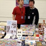
I had a great time over the weekend of 23-24 February 2013 at the London Super Comic Con, sat next to my usual table buds Zarina Liew and Van Nim

Thank you to everyone who came along to my table, and especially those of you who bought comics and prints. Much appreciated!

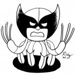
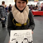
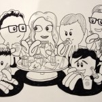
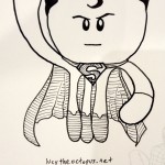
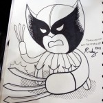
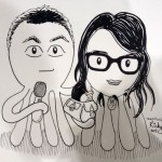
Also had lots of fun doing Lucy the Octopus style commissions

It was very cool meeting David Mack, Klaus Janson and Bill Sienkiewicz there.  I got to see half inked pages of future issues of Daredevil End of Days and listen in as Alex Fitch interviewed them for an upcoming episode of his Panel Borders radio show.
So great to meet creators you’ve admired a long time and have them turn out to be friendly, generous and despite their immense talent, modest.
I drew a Lucy the Octopus style version of David Mack’s creation Kabuki (one of my favourite comics ever) and gave it to him.

Another highlight of the event for me was getting a very cool Buffy sketch from the talented and pleasant to chat to artist of Darkhorse’s Angel & Faith, Rebekah Isaacs.

All in all, a great weekend and start to a year full of cons…